From 2019 the Institute of Physics of the Czech Academy of Sciences will start using a new logo. The new form of the logo has emerged from a two-round designer competition and it follows the path of re-design – it retains the message and the symbolism of the former logo, but it allows the institute to present itself to a wider audience, mainly abroad.
"The creation of the new logo was motivated by the need to present the Institute of Physics unequivocally on the international scene. The new form of the logo meets this need not only by its English variation but also by introducing an FZU abbreviation which clearly identifies our institute,” says Michael Prouza, Director.
New form
Two primary variations of the new logo in Czech. Analogously there is an English and multilingual variation. The use of all the composition and colour variations is described in a graphical manual.
The Institute of Physics is changing its face after more than 10 years when a logo with a stylized symbol of an atom/planet and a human eye has been used. The use of these elements depicts the width of the themes the Institute of Physics focuses on, and therefore there was a wish to retain this symbolism. The central motive is the symbol of an eye (vision, knowledge, perception) with a symbol of the physical world which extends from the microworld (the symbol of a trajectory and elementary particle) to macroworld (at the same time also a symbol of a space body orbit).
In the competition for the new logo running since the beginning of 2018, more than 40 concepts by seven approached applicants were entered. The author of the winning design Simon Antilov says: “The resulting form of the redesign is built on the geometry of exactitude with the element of spatiality and motion. The central motive of an eye does not lose any of its effectiveness even though it is now not drawn as a whole. The thicker lines contribute to a more modern appearance of the logo and adapt it for graphical applications.”
The change was also inspired by the recent change of the Czech Academy of Sciences logo – one of the primary requirements for the graphic designers was a mutual harmony of the two logos. The resulting FZU logo thus consists of two shades of blue: the lighter one ensuring harmony with the Czech Academy of Sciences logo (it is the same colour) and the darker one representing the link to the current colour scheme. A second harmonising element is the use of a unified and freely accessible Open Sans font, which will also be used in other materials of the Institute of Physics.
Harmony
The Institute of Physics and the Czech Academy of Sciences logos are matched up by means of the same shade of a light blue colour and the font used.
The logo has been created in several compositions, colour and language variations which can be downloaded from the FZU website. The rules for the use of the new logo and its individual variations are described in detail in the Visual identity manual. The new visual identity related to the logo will gradually be introduced into the official and accompanying materials of the Institute of Physics, including the new web site.
Examples of the new logo of the Institute of Physics
Business Cards
Additional materials use an abstract background which complements the logo by means of its structure and colour scheme and it serves mainly as a bold underlying surface on which then either a white logo or heading are accented. The background is constituted of fractal micro/macro cosmos which symbolizes the field of physics.
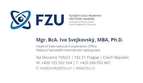
The front side of the business card displays a logo on a fractal background. The backside contains a bilingual horizontal logo and the complete information and contacts. This results in a clearly arranged and elegant business card with a sufficient amount of information.
A4 documents
Different versions of title pages of a document illustrate the use of the logo with individual backgrounds and potential logos of other institutions.
Calendar of the Institute of Physics for the year 2019
The full-colour negative variation is suitable for dark backgrounds. On the title page of the calendar, there is a bilingual logo and in January the economical variation with the symbol and the FZU abbreviation is used.
The authors of the photos are Zdeňka Hájková and Matěj Hývl (from the left).


